interview
Atelier Brenda: Thinking Beyond The Format
Melisa Cenik
Melisa Cenik is the editor-in-chief of The Couch and loves the interaction between the digital and physical world probably more than her favorite dish. Call her a millenial. Her previous and current endeavours are rooted in music, culture and art.
17
min read
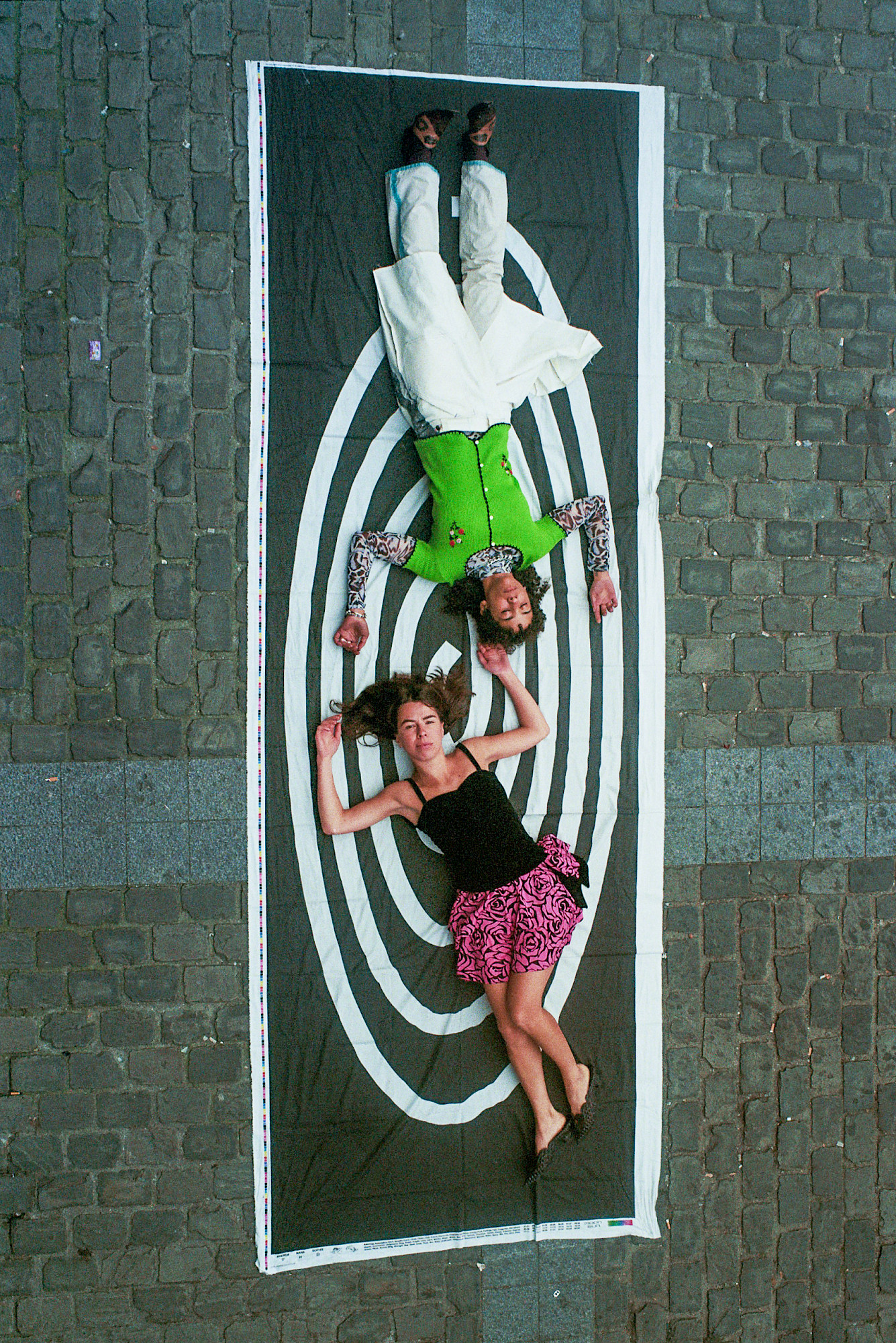
Brussels-based graphic studio Atelier Brenda was founded 11 years ago by good friends Sophie Keij and Nana Esi. The two have been making big (design) waves lately that didn’t go unrecognised, catching eyes with their remarkable and innovative work for initiatives such as kanaal40 and Beursschouwburg. It seems that whatever comes from their hands pushes the boundaries of design, whilst embracing their ability to think beyond any format.
Last February we reached out to Sophie and Nana to design our visual identity of The Couch. We asked them an abstract yet straight-forward question: how do we use the idea of a physical reference (the physical Couch in Het HEM) to create a digital format and identity? Together with Joel Galvez (our developer and interaction designer) we made what is now The Couch—although to us and them, it will always be a work-in-progress. That said, we thought it was about time to dive into the brilliant minds of Sophie and Nana, so I (Melisa Cenik, Editor-in-Chief of The Couch) sat down with them to talk student times, visualising and conceptualising ideas, the difficulties and complexities of the technical aspects and the future of design.
Hello Sophie and Nana! We thought it would be nice for readers to get to know you - the brains behind our visual identity - a little bit better. So let’s dive into it right away: you know each other from school, right?
Sophie: Well, actually we knew each other from before that! We had common friends in high school, so we were aware of each other's existence but weren’t hanging out at the time. When we graduated, we both moved to Ghent and started living on our own. Somehow our friend groups got closer and so did we—from there we became friends. Only later we also started doing the same studies as well.
“We wanted to create worlds together, in whatever way possible”
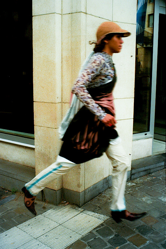

What kind of students were you, and were you already working together back then?
Nana: I was very motivated and really into design. I always was that kind of person that thought it was important to do stuff besides school, and I would automatically lean towards others out there that had the same mindset. In general I’m quite happy when I think back about my studies, although it took me quite some time to finish. Sophie and I were not in the same class because I decided to re-do my second year—not because I had to, but because I thought I didn’t learn enough yet in that year. They thought I was crazy, but for me it was never about finishing fast, but about getting as much out of it as possible. That’s also why I didn’t do my masters at that time—I just wasn’t ready for it yet.
Sophie: I graduated in Interior Design. In school I liked my atelier classes best and wasn’t so interested in going to the research and theory related classes. I just didn’t have the motivation for it. But somehow I managed to get through it as I always asked for the notes of my classmates. [Laughs] I just realized that I wanted to spend more time on the things that I did like, so I didn’t prioritize going to the classes that I didn’t find interesting.
I read in another interview that you started Atelier Brenda after working together as creative directors for a party?
Sophie: That party was Nana’s birthday party!
Nana: [Laughs] It was not really a party-party, it was more a collaboration on a personal level. Atelier Brenda was initially set up with 3 people, and together we organized that birthday party. The other person in the group quit because of doubts about whether they really wanted this, and Sophie and I decided to continue. We figured out quite quickly that we have the same motivation and passion towards things—we wanted to create worlds together, in whatever way possible. In the first place this was more on a broader level, as it was not specifically focused on graphic design. It was only later that we started to specialize more on one medium. Other people wanted us to also continue doing the other things we did, but there was never really money to explore other formats. [Laughs] Basically, we thought it would economically be more interesting to focus on graphic design.
Haha, that’s a very honest answer.

Sophie: We just had trust in our process. To be honest, we also just rolled into certain assignments or opportunities that we got. Some things happened more strategically, others really just happened. When things develop organically within something you start, you can come up with how to do it along the way. What works, what doesn’t? We still do it that way.
Some of these projects you’re doing are rooted in art, others lean more towards music. I really like that about what you do - you’re shifting in between these cultural scenes that have a big crossover with each other as well. How’s that for you? It’s also two areas that you’re interested in, it seems.
Sophie: I think those two worlds are meant together, and it’s indeed also out of personal interest. We sometimes work in fashion or in collaboration with brands as well, but in general we focus on cultural partners. It’s part of who we are.
Nana: It’s important for us to do multiple projects at the same time, and that there’s also some overlap between certain things we do. For example, to only make identities, record sleeves or books; it gets a bit boring to work with the same medium constantly. We are interested in new experiences and challenges in order to work together with different kinds of people and find common grounds together. It keeps us fresh and shows us other perspectives and pushes us to think beyond the binary. Overall we are not interested in following a certain standard that is expected of us from the outside world. We don’t want to be super anti-everything, but we always try to move in between what’s being expected of us and how to give a push back on that.
Sophie: Exactly. We thrive for something new, but that’s also the exhausting part of it because we cannot really come up with a set system or rhythm that works for us. We of course have our ways and methods, but every new assignment that we do is customised and needs a personal approach. We can’t just copy how we work.
Nana: Every time we think: “we’re going to keep it simple this time”, it just turns out the opposite. It’s just who we are, I guess. It’s against our nature to make it easy. [Laughs]
Sophie: You could kind of compare it with a chef. A lot of restaurants have a set amount of recipes they always make. That could make everything way easier and more efficient, and maybe at the end of the day it even brings a lot more money to the table [laughs]. For us this is different, because we have to make these recipes from scratch every time. We have our cookbook and we have our ingredients and techniques, but the way we make the dish is different every time. That’s also why it’s difficult for us to find people to work with within our studio — Nana and I get each other on another level, and it’s almost impossible to make someone else understand what’s going on in our heads.

Speaking about projects and customised ways of working: we approached you back in February I believe and the ball started rolling from there. Without sounding too self-indulgent, what made you interested in doing this together with us?
Sophie: We have always been intrigued by Het HEM, but we have to admit: we have never been! [Laughs] But yeah, we have been following the programming which we like, so there was interest from that side. We want to work with people and partners that believe and have interest in us as much as we do in them. There should be room for dialogue and understanding, and we felt that was the case.
Nana: [Nods] Next to that, it was a new approach coming from you as Het HEM as well.
“We didn’t want to translate “the couch” too literally though—we wanted it to be about softness”
That’s very true, it’s a totally new road we’re now exploring. That said, the digital Couch is really a place where - just like a physical couch - you can rest, grab a book and read, just lay down or do nothing at all. You can use it as you like it, the pace is slow and there’s no actual need to do something. How do you translate an idea as abstract as ‘rest’ into a visual and graphic identity?
Sophie: It starts with a good overview of the (future) content and a clear brief. Usually, there are some visual references in there that we can use or get inspired by. From there, we start doing research and develop a concept. Mostly from dialogues between Nana and me, but also between us and the partner, a lot of ideas are naturally created. We inspire each other in these talks—it's ping-pong. The first phase is usually the easiest, after that you sometimes bump into complexities, or you get frustrated that the things you have in your head are difficult to translate to the screen. It’s like waking up from a dream which you remember, but are not able to put into actual words. That, I find very annoying sometimes.
Nana: With The Couch, it was clear from the start what we were dealing with. It was not so much about knowing what kind of content was going to be published, but about taking inspiration from a physical concept (The Couch is also a physical place in Het HEM, red.) to the digital realms, and focusing on the philosophy behind that. There were many angles in there for us to work with, so it was an easy mind-trigger. The name “The Couch'' itself already says a lot. That’s how we came up with the concept sentence: the cozy, deep & functional couch supports our bodies & bounces back to reset”.
Sophie: This was the foundation of our concept. We took different elements from that and started visually exploring. For example, we wanted it to be approachable, in-depth, easy to use, readable, amongst other things. Rapidly after we came up with the idea of using memory foam from an actual couch as the main inspiration, in combination with the usability and the functionality of an e-reader. Those became two very strong elements that we used in the visual identity. We didn’t want to translate “the couch” too literally though—we wanted it to be about softness, just like the memory foam or landing on your couch after a long day.
Nana: Our initial idea was to focus on neomorphism design, which was a direct inspiration from the memory foam. We wanted the website to be as less distracting as possible and play with softness, mono colors and shadows which should have created a new dimension. Eventually we wanted to experiment with how fast and slow this dimension could show itself and move within the website. But the ideas were technically too ambitious, so we had to go back to the initial concept and tweak from there. This is also reality–these things happen within such a process.

Earlier you mentioned how you took inspiration from the physical idea of The Couch and brought this to the digital spheres. Working with these two types of medium is nothing new to you though—for us it was pretty clear from the start that you like to think beyond any format. It feels like there’s almost no restrictions when talking to you both. How do you see the relation between a physical and digital space and what excites you about it?
Sophie: Usually, people have a physical product or space and from there want to create a website. Those two media, digital and physical, go hand-in-hand—they are not two totally separate things for me. The one has restrictions that the other doesn’t, and vice versa. Some say that everything online is very flat and doesn’t have any texture or materials that you can touch, but there’s so much in the digital spheres that you can do by - for example - coding or moving image. The correlation between these two media, and in general thinking beyond that box, makes possibilities endless. They don’t have to be a direct translation of each other—it can be complementary to each other. Only then things become more hybrid.
Actually, this is exactly what I find remarkable - that people sometimes see a digital and physical space as something either completely different or as an extension of the other medium. It’s not being treated as a medium of its own with its own capacities to benefit from the other medium.
Sophie: Totally. I like that we’re now working on a 3.0 version of The Couch. It gives room for development and growth, and that’s something Nana and I both find key in how we work. Some people like to be more straight-forward and goal orientated - which is completely fine of course, we also have it in a way - but it’s important to see something as never finished. It’s important in anything you do really; that something is always a work in progress and editable along the way. With a digital platform it’s of course way easier than with a physical product like a book, and that’s the fun part about it.
Enough about The Couch! What other new projects are you working on at the moment, what’s in the pipeline?
Sophie: Always a difficult question [laughs]. We do so many different things…
Nana: There’s a bookings agency that we’re currently doing the identity for, together with Studio Latitude. Also there’s Contour, an art biennial focussing on independent film. And of course Beursschouwburg, which is a project we’ve been working on for years. There’s some other potential projects as well, but we cannot say anything about that yet.
Sophie: Nana also teaches at the Royal Academy of Antwerp, by the way! And we do work for ourselves as well besides the collective things we do for Atelier Brenda.
After all these years, do you see similarities in the work you do solo?
Sophie: We influence each other a lot. We ourselves see it when something is designed by one of us or by us both, but the outside world might not see a big difference. We’re fans of each other's work at the end of the day.
Nana: The way Sophie and I worked together back in the day is that we were both very referential from the start. We look for an intuitive visual language that makes us understand what kind of quality we’re aiming for, or the weirdness and aesthetics we’re looking for. We were never interested in copying work from others–if people would ever accuse us of this, it would be a big blow in the face because we are our own worst critics. We cannot even copy our own work, let alone others’ work [laughs]. After 11 years of Atelier Brenda there’s one thing I can say with full pride, and that’s that we’re always trying to have an innovative approach to whatever we get our hands on. We don’t only design for ourselves–we design because we want to have a reaction from a peer group or from a crowd, big or small, that understands the referential framework in a cognitive or intuitive way.
“The interesting interaction between the physical and the digital and that not everything is directly translatable–that’s important for the future of design.”

The Couch has now been live for 1.5 months. As artists, what would you like to see and explore on The Couch?
Sophie: There’s always a lot of good films and documentaries programmed during art festivals, but for some reason I have a hard time watching these on the spot. I just see bits and pieces and I think: “I’ll watch it at home”. Once home I always realise that they are, of course, never on the internet. For example the Tresor 31 exhibition I saw in Kraftwerk had a lot of video fragments of artists like Arthur Jafa, Hito Steyerl and Jenn Nkiru that I enjoyed. And also the documentary in Enzo Mari’s show for the Tony Cokes audio & video installations at Argos was something that I would have loved to watch back. It would be so nice to have these kinds of screenings on, for example, The Couch so I can continue watching them.
Last but not least a meta question: what does the future of design look like to you?
Nana: The interesting interaction between the physical and the digital and that not everything is directly translatable–that’s important for the future of design. When we get asked to design an identity, we notice that people are like: “we need an Instagram, and Facebook, and TikTok, and a website, and and and”. It’s a lot of “and”. It’s way more interesting to think about why you’re doing it, in what way and therefore on what platform. When both designers and the people who ask the designers communicate outside of the usual patterns, you’re going to be able to think more of what fits your initiative best, rather than what you believe you need to do. It’s about creating a holistic approach.
Sophie: Thinking more futuristically, I would love to spend fewer hours working on so many different programmes [laughs]. I want more time for creativity. To translate the ideas in my head quicker to the screen. So on one hand more control and automation on a technical level, and fewer corrections and Zooms on the other! In this way, it would also be easier for young designers to survive, because you always have to fight or work for free in the beginning, to prove something. I think that morality comes from the times we live in–everyone has design programmes, everyone can do it and it’s accessible. I hope that maybe in the future people give more trust and autonomy to us as designers, and start realizing that designing is a real job [laughs].
Nana: It’s an industry that changed completely–graphic design was more linked to advertisement back in the days. I think if Sophie and I would have been men in the fifties who did this job, we would have been crazily rich.
Sophie: [Laughs] Maybe you and I should change Atelier Brenda to a man’s name after all.
Nana: [Laughs] Atelier Brendan!
